English 1102
V- Visual
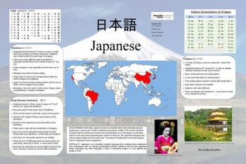
Poster on Japanese (JPG) [full poster resolution]
This poster on the Japanese language was created by Hunter Scott, Sho Shinotsuka, Lucy Hensley, and Payne Thompson. Our first draft of the poster was less effective than the final version because it was very cluttered. The layout was good, but there was too much text. It was almost like a paper just pasted on the poster. This was corrected by removing a lot of text and placing it in gray text boxes to make it look neater. We also changed some of the text to bullet points rather than paragraphs. This helped make the information more precise and readable to the audience. The audience consisted of people who were largely unfamiliar with Japanese, so we ensured that the posted presented information accordingly. For instance, we didn't assume any information that the audience would not know.
We used GIMP and Microsoft Publisher to create the poster. We made sure to use a sans serif font so that the text could be read easily from far away. We used a faded background image across the entire poster. This unified the poster and made it more visually pleasing. We avoided using templates or premade designs to ensure that the design didn't look too cookie-cutter. We also put all of the text in text boxes with rounded corners and made them slightly opaque. We found that this looked more professional and since you could still see the background a little bit, it felt more uniform.
We all learned how to use the plotter which I'm sure we will use for future projects. We also each worked on separate parts of the poster. I was skeptical that this would work, but it actually worked very well. One person worked on text, another on layout, and another on images. We sent our part to one person who merged it all. We then met to tweak the design and proofread the text. This system worked well and we were able to finish the poster very quickly.
